When discussing color, the term “value” often surfaces as a crucial element in art and design. Understanding color value differences is not only fundamental to creating visually striking compositions but also essential for achieving a harmonious balance in visuals. This article delves into the complexities of color value, shedding light on its significance and application in various fields.
Read Now : Co-creating Content For Audience Development
The Importance of Color Value in Design
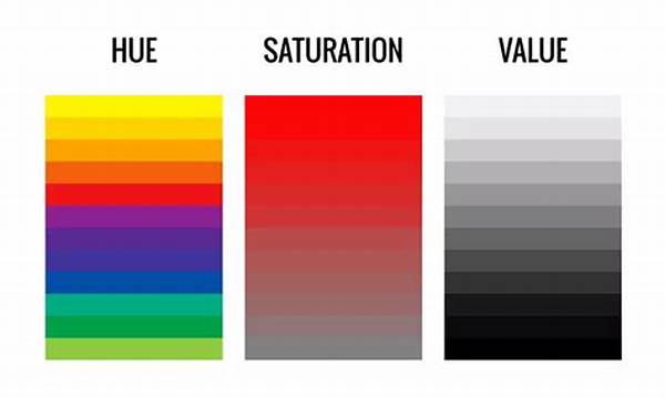
Color value, a measure of the lightness or darkness of a color, plays a vital role in determining the mood and focus of a design. It is not solely about the hues used but how those hues vary in value to create depth and contrast. By understanding color value differences, designers can emphasize parts of a composition, draw attention to focal points, and ensure that the design conveys the intended message effectively.
In visual arts, those who grasp the concept of color value can manipulate it to create realistic depictions or abstract interpretations. Subtle shifts in value can transform a flat design into a dynamic visual experience, keeping the audience engaged. Whether for digital media, fashion, or architecture, understanding color value differences helps professionals make informed decisions that enhance the viewer’s experience by creating balance and rhythm in their work.
Moreover, the knowledge of color value differences enables creators to overcome challenges related to accessibility. By considering how different color values impact readability and perception, designers can craft visuals that are accessible to a broader audience, including those with visual impairments. This mindfulness towards inclusivity enriches the impact of their work and aligns with the universal design principles.
Techniques for Mastering Color Value Differences
To begin with, understanding color value differences requires training the eye to discern subtle variations between light and dark. A practical approach is to practice with grayscale sketches, removing the distraction of hue to focus solely on value. This exercise enhances one’s ability to see contrast without the complicating factor of color.
Another effective technique involves creating value scales. By organizing a sequence from black to white and noting the midpoint grays, one can visualize the range of possible values. This foundational skill enables designers to effectively map out the gradients in their work, ensuring balanced composition through an understanding of color value differences.
Analyzing the works of masters, such as those in classical paintings, can provide insight into the successful use of color values. Observing how artists balance light and shadow offers practical lessons in understanding color value differences and applying this knowledge to contemporary designs.
Applying Color Value in Various Industries
Understanding color value differences is paramount across multiple industries, particularly in areas like interior design, where lighting plays a central role in how color is perceived. Designers adept in handling color values can manipulate ambient and artificial lighting to set the mood of a space, highlighting or downplaying certain areas for effect.
Photography is another field where understanding color value differences is crucial. Photographers use the notion of value to structure compositions that captivate the viewer’s eye and evoke emotion. Mastery over value differences aids in creating images with depth and visual intrigue, often setting apart novice work from professional-level artistry.
Similarly, in film and theater, lighting designers leverage understanding color value differences to direct audience attention, build tension, and convey thematic undertones. Through strategic lighting and shadow play, scenes come alive with nuanced storytelling, underscored by the deliberate manipulation of color value, engaging the audience more deeply.
Addressing Challenges with Color Value
Understanding color value differences also entails mastering the challenges associated with working in multicolor environments. One common issue is ensuring adequate contrast for text in graphic designs. High contrast between text and background enhances readability, crucial in developing user-friendly interfaces.
In branding, understanding color value differences enables the creation of logos and promotional materials that stand out whilst maintaining visual coherence. A brand’s identity thrives on its recognizability, which is amplified when colors within its visual assets are well-balanced and impactful through mindful value usage.
Another challenge is incorporating color value differences in diverse media. Different technologies render color differently; hence, digital designers must comprehend how values might appear across screens. This knowledge assists in achieving consistent output across various platforms, ensuring the visual essence of the design remains intact.
Balancing Colors with Value
Effective use of color often hinges on the ability to balance those colors within a composition. A keen understanding of color value differences enables a nuanced approach to balancing, ensuring that no single color overpowers the others unnecessarily. This balance is critical in fostering coherence within visual projects.
Read Now : Original Artistic Character Formation
Balancing also entails the creation of a hierarchy within a design. By adjusting values, focus can be shifted or highlighted, guiding the viewer’s eye naturally along the intended path. Understanding color value differences in the composition serves as a tool to manage visual perception and audience engagement, essential for creating effective designs.
Identifying and correcting color imbalances involves an iterative process of evaluating how shifts in value affect the overall harmony of the design. This dynamic process ensures continuous improvement and mastery over using color values. Additionally, consistent practice in observing and applying color value adjustments enhances intuitiveness, an invaluable skill for any visual designer.
Creating Dynamic Designs
To effectively produce designs that resonate, an emphasis should be placed on the dynamic use of color values. Dynamic contrasts within a piece can create a sense of movement and energy. Understanding color value differences allows designers to play with value gradients, enhancing the visual impact of their work.
Dynamic designs are often characterized by a deliberate manipulation of values to evoke specific viewer responses. Whether aiming for tranquility, excitement, or urgency, the strategic use of color values facilitates achieving the desired emotional effect. This strategy is highly effective in advertising and entertainment, where grabbing and maintaining viewer attention is paramount.
Furthermore, understanding color value differences aids in injecting vitality into two-dimensional designs. By considering how value affects spatial positioning within a piece, designers can simulate three-dimensionality, adding depth and sophistication. This skill is particularly advantageous in creating lifelike visuals and artwork that challenge the viewers’ perceptions, enriching the overall visceral experience.
Exploring Depth Through Color Value
An insightful exploration of depth facilitated by color value involves understanding color value differences in relation to spatial perception. Depth can be suggested by the tonal nuances within a design. The lighter values typically recede into the background, while darker values advance, creating a perception of depth and volume, crucial for compelling visuals.
The manipulation of these values allows for transformative experiences in visual storytelling. By adjusting color values, artists can subtly guide the audience through a narrative, creating intricate layers of meaning that resonate emotionally. Understanding color value differences, therefore, becomes key to unlocking the full storytelling potential Visual cues guided by value differences enrich narratives with multiple layers of context.
Furthermore, when examining extensive works like murals or stage designs, understanding color value differences proves essential in distinguishing main elements from supportive background elements. This selective emphasis helps distinguish narrative components, contributing significantly to the overarching dynamic flow of the piece and retaining viewer engagement through strategic visual orchestration.
Challenges and Opportunities in Value Variation
While understanding color value differences offers numerous creative opportunities, challenges often arise when attempting to maintain appropriate value contrast across different viewing conditions. Adapting designs for various lighting conditions requires consideration of how value perception changes with light intensity, an advanced skill that refines professional practice.
Such challenges often present opportunities for innovation. Designers who proficiently navigate value differences develop adaptability in their work, allowing for the seamless transition of design intent across diverse environments and media. Thus, while understanding color value differences may have its hurdles, overcoming these challenges fortifies a designer’s skillset and adaptability.
In sum, a deeper grasp of the nuances within color value differences facilitates informed creative decisions that enhance the aesthetic and functional quality of visual works. This deeper understanding becomes pivotal in enthralling audiences, raising the bar of design excellence, and meeting professional challenges with innovative solutions.