Typography in UI design is a vital component that significantly impacts user experience and the effectiveness of a digital interface. In an era where screens are a primary mode of communication, the way text is presented can either draw users in or turn them away. A well-thought-out approach to typography ensures clarity, enhances readability, and fosters an engaging atmosphere that aligns with a brand’s identity. This article delves into various facets of typography in UI design, exploring its importance, best practices, and evolving trends.
Read Now : “enhancing Brand Image With Colors”
The Importance of Typography in UI Design
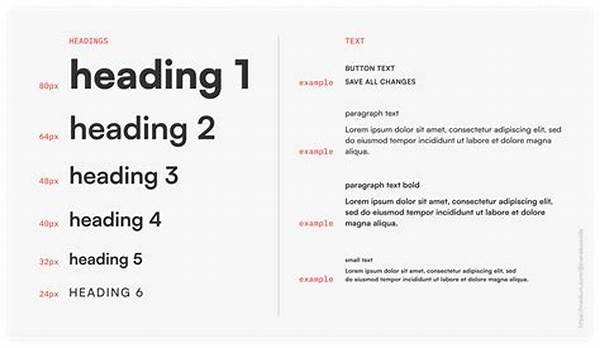
In the realm of user interface (UI) design, typography is much more than a matter of aesthetics. It serves as a crucial bridge between the user and the digital interface. Firstly, typography in UI design provides visual hierarchy, guiding the user’s eye toward the most important elements on the screen. By utilizing varied font weights, sizes, and styles, designers create a structure that prioritizes information and enhances navigability. Additionally, typography sets the tone and personality of the interface, reflecting the brand’s voice and evoking emotional responses. For instance, a playful typeface can convey a sense of fun, while a more formal font choice might reflect professionalism. Furthermore, good typography in UI design contributes to accessibility. Text legibility, contrast with backgrounds, and appropriate line spacing ensure that content is easily readable for all users, including those with visual impairments. As technology evolves, so too does the scope and impact of typography in UI design, making it an ever-intriguing subject for designers and brands alike.
Best Practices for Typography in UI Design
1. Consistency is Key: Consistency in typography in UI design ensures that users can quickly understand and navigate through the interface without confusion.
2. Readability Matters: Prioritizing readability helps users to efficiently process the information presented, making sure that content is accessible to all.
3. Hierarchy Creation: Designing a visual hierarchy with typography in UI design allows key information to stand out, guiding users’ attention strategically.
4. Responsive Design: Typography in UI design should adapt across various devices and screen sizes, maintaining readability and visual appeal.
5. Alignment and Spacing: Thoughtful alignment and spacing enhance the neatness and balance of typography in UI design, creating a clean flow for users.
Trends in Typography in UI Design
As digital interfaces continue to evolve, so do the trends associated with typography in UI design. One prominent trend is the use of variable fonts, which offer flexibility in weight, width, and slant within a single typeface. This innovation provides designers with greater creative freedom while conserving loading times, enhancing user experience. Another trend is the focus on bold and expressive typography, which captures attention and conveys strong brand messages. This approach often includes oversized fonts and vibrant colors, breaking traditional typographic norms to create memorable interfaces. Moreover, the integration of typography in UI design with motion graphics has gained popularity. Animated text can engage users by adding dynamic storytelling elements, drawing them deeper into the content. This technique aligns with the growing emphasis on creating compelling user experiences that keep audiences engaged and entertained. As these trends unfold, designers continue to push the boundaries of typography in UI design, consistently seeking new ways to innovate and captivate viewers.
Challenges in Implementing Typography in UI Design
1. Balancing Creativity and Functionality: Designers must strike a careful balance between innovative typography in UI design and maintaining usability and readability.
2. Cross-Browser Compatibility: Different browsers may render fonts differently, presenting challenges for consistency in typography in UI design.
3. Cultural Sensitivity: Typography in UI design must consider cultural differences in font perception and preferences, especially for global applications.
4. Performance Optimization: Implementing intricate typography in UI design requires optimization to ensure fast loading times and smooth user experiences.
Read Now : Content Marketing Ideas For Art Print Businesses
5. Dynamic Content Management: Typography in UI design should adapt to diverse and frequently changing content without compromising on user experience.
6. Accessibility Challenges: Ensuring that typography in UI design meets accessibility standards can be complex yet essential for inclusivity.
7. Maintaining Brand Identity: Typography must consistently reflect the brand’s identity across all interfaces, maintaining brand recognition.
8. Integration with Visual Design: Seamlessly integrating typography in UI design with other visual elements is crucial for a cohesive overall look.
9. Hierarchy Mismanagement: Poor hierarchy in typography can confuse users, highlighting the necessity of strategic design practices.
10. Technology Constraints: Designers should be aware of technological limitations that may affect the implementation of typography in UI design.
The Role of Typography in Enhancing User Experience
Typography in UI design plays an indispensable role in enhancing user experience. At its core, typography acts as a vehicle for delivering content, helping users to easily comprehend and engage with information. When typography in UI design is thoughtfully executed, it can elevate the overall aesthetic of an interface, making users feel more connected and immersed in the brand. By crafting clear and distinct typography, designers can communicate messages with precision and impact, affecting how users feel about a product or service. Additionally, effective typography in UI design reduces cognitive load. By using signifiers such as headings, bullet points, and typography variations, designers can guide users effortlessly through content, ensuring they absorb key information without extra effort. This seamless experience encourages users to explore further and reduces the likelihood of frustration or abandonment. As designers continue to innovate, typography in UI design remains a fundamental aspect that significantly influences the success of digital products and services.
Conclusion
Typography in UI design is an essential ingredient in crafting compelling digital interfaces. A critical component of effective communication, typography bridges the gap between visual aesthetics and functional usability. By appreciating the nuances of typography, designers can create interfaces that not only look appealing but are also highly functional and accessible. This understanding allows brands to express their identity consistently, creating a memorable user journey that resonates with audiences. As typography in UI design evolves, it remains a timeless pursuit of balancing form and function, continually adapting to new technologies and user expectations.
Summary of Typography in UI Design
Typography in UI design is a multifaceted discipline that greatly influences the effectiveness and enjoyment of digital interfaces. By optimizing readability, establishing visual hierarchy, and maintaining brand consistency, typography enhances user engagement. The importance of typography extends beyond mere aesthetics; it impacts accessibility and user comprehension. As technologies and trends advance, designers continuously adopt innovative methods to elevate typography in UI design. From variable fonts to dynamic animations, modern approaches push traditional boundaries, resulting in more immersive and interactive user experiences. Ultimately, typography in UI design requires a strategic approach to meet the diverse needs of users while anticipating future technological shifts, ensuring that digital products remain relevant and impactful.