Creating a visually appealing design is an art that involves an understanding of the principles for color harmony design. In the world of design, color harmony can greatly influence how a message is perceived and can significantly affect the overall impact of a project. This comprehensive guide aims to shed light on the key principles for achieving color harmony in design, ensuring that your projects are not only attractive but also effectively communicate the intended message.
Read Now : Cross-platform Branding Consistency
Understanding the Basics of Color Harmony
Color harmony in design is more than just choosing colors that look good together. It involves a complex process of combining colors in a way that is pleasing to the eye and creates a balance that enhances the overall aesthetic of a design. The principles for color harmony design include a deep understanding of the color wheel, utilizing complementary, analogous, and triadic color schemes, among others. These principles help designers create cohesive and visually pleasing designs without overwhelming the viewer. By understanding and applying these principles, designers can ensure that the colors they choose not only align with their brand’s identity but also evoke the desired emotions and reactions from their audience.
In practice, applying principles for color harmony design involves considering the cultural connotations of colors, the mood one wishes to convey, and the audience’s expectations. Color harmony is not about uniformity, but about creating a sense of balance and completeness. When colors are harmonized properly, they can guide the viewer’s attention to the focal points of the design, enhance readability, and bring structure and clarity to the overall layout. Therefore, understanding these principles is crucial for anyone looking to excel in the field of design.
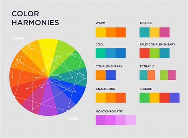
Types of Color Schemes in Design
1. Complementary Schemes: These involve using colors directly opposite to each other on the color wheel to create vibrant and high-contrast designs. This is a fundamental principle for color harmony design.
2. Analogous Schemes: This scheme involves selecting colors that are next to each other on the color wheel, resulting in calming and serene designs.
3. Triadic Schemes: Utilizing three colors evenly spaced on the color wheel offers vibrant designs while maintaining balance, an essential principle for color harmony.
4. Split-Complementary Schemes: This approach involves using a base color and two adjacent tertiary colors to the complementary color, achieving a contrasting yet harmonious effect.
5. Monochromatic Schemes: Focuses on variations in lightness and saturation of a single color, this principle for color harmony design can create a cohesive and melodious look.
Strategies for Applying Color Harmony in Design
To begin, understanding the psychological impact of color is crucial. Each color can evoke different emotions and convey various messages, so employing principles for color harmony design must consider these psychological aspects. For instance, blue often embodies calmness and reliability, making it perfect for corporate design, while red can evoke passion and energy, suitable for calls to action.
Moreover, consistency is a significant factor when applying the principles for color harmony design. Maintaining a consistent color palette throughout a design project ensures a unified look and helps in building a recognizable brand identity. It’s important to not scatter too many different colors across a design, as this can confuse the viewer and dilute the message.
Finally, testing designs in different formats and lighting conditions ensures that they always look their best, regardless of how they’re displayed. The principles for color harmony design require flexibility and adaptability to achieve a visually appealing composition across various media.
Ten Considerations for Achieving Color Harmony
1. Balance: Always aim for visual balance by distributing colors evenly across your design.
2. Contrast: Use contrast strategically to highlight important sections and enhance readability.
3. Cultural Context: Understand cultural meanings of colors to prevent sending the wrong message.
4. Scalability: Ensure your color design can be adapted for different scales—from print to digital media.
5. Hierarchy: Utilize color to establish a clear visual hierarchy, drawing attention to key elements.
Read Now : Identity System Policy Adherence
6. Accessibility: Consider color accessibility to ensure inclusivity for those with visual impairments.
7. Mood Setting: Choose colors that align with the intended mood and message of your design.
8. Variety: Even within harmony, incorporate a variety to avoid monotony.
9. Feedback: Gather feedback to see how the color palette resonates with others.
10. Experimentation: Don’t be afraid to experiment within the framework of principles for color harmony design.
Practical Applications in Modern Design
The principles for color harmony design are evident in several aspects of modern design. For instance, in user interface design, these principles help create intuitive and aesthetically pleasing applications that users find engaging and easy to navigate. By applying harmonious color schemes, designers can influence how users interact with digital products, making their experience more enjoyable and intuitive.
These principles extend beyond digital design into branding, packaging, and even interior design. In branding, a well-chosen color palette can establish a strong brand identity and differentiate a company in a competitive market. Packaging designs benefit from harmonious colors by captivating consumers and communicating brand values effectively on the shelf. Similarly, the interior design industry uses these principles to create spaces that evoke specific emotions and atmospheres, whether it’s the calming hues of a spa or the vibrant tones of a restaurant.
By understanding and using the principles for color harmony design, designers across these various fields can create environments and products that not only please the eye but also foster a connection with the audience, ultimately leading to greater success for their projects.
Delving Deeper into Color Interactions
Understanding the nuances of color interactions is another cornerstone in mastering the principles for color harmony design. Colors do not exist in isolation; their perception can change drastically depending on adjacent colors. This phenomenon, known as simultaneous contrast, occurs when two colors placed side by side affect how each other is perceived. For example, a gray shade might appear lighter against a dark blue and darker against a light yellow, illustrating how context can alter color perception.
By mastering these interactions, designers can manipulate visual elements to create desired effects, leading to more dynamic and engaging designs. Exploring these intricacies not only takes the aesthetic appeal of a design to the next level but also enhances its functional effectiveness, ensuring the message is communicated as intended.
Summary: The Essence of Color Harmony in Design
In summary, grasping the principles for color harmony design is pivotal for any designer aiming for excellence. These principles offer a framework for creating visually appealing and emotionally resonant designs, ensuring that a project communicates its intended message effectively. By balancing color theory with creativity, designers can produce works that attract and engage their target audience.
Ultimately, the principles for color harmony design serve as a foundation upon which a designer can innovate and push boundaries. While the rules provide guidance, they also invite exploration and experimentation. Whether the goal is to establish a brand, enhance a digital interface, or create an inviting physical space, color harmony remains a vital element in the designer’s toolkit, one that can transform a simple idea into a captivating reality.