Creating a comprehensive UI design style guide is essential for ensuring consistency and coherence in user interfaces across a digital product. By defining specific standards, color palettes, typography, and design principles, a UI design style guide helps teams to collaborate efficiently and maintain a unified look and feel. This foundational document serves as a valuable reference, making it easier for developers and designers to create a visually harmonious and user-friendly interface. Let’s delve deeper into the components and advantages of crafting an effective UI design style guide.
Read Now : Harmonized Brand Typography Standards
The Importance of Consistency in a UI Design Style Guide
In the highly competitive digital world, maintaining a consistent user interface is crucial. A UI design style guide lays the groundwork for achieving this consistency, thus enhancing user experience. By providing a central repository of design standards, these guides eliminate ambiguity, making it straightforward for various team members to align their work with the established visual language. It’s important to understand that a UI design style guide is not just a set of rules; it is a living document that evolves with creative input and technological advancements, ensuring that the design remains fresh and relevant.
Consistency in a UI design style guide does more than just maintain visual harmony; it also builds trust and familiarity with the end-users. When users interact with a user interface that appears and behaves predictably across all touchpoints, they feel more comfortable and confident in using the product. This can lead to increased engagement and satisfaction, two critical factors for digital product success. By investing time and effort in developing a robust UI design style guide, teams can foster a cohesive design culture that benefits both creators and users alike.
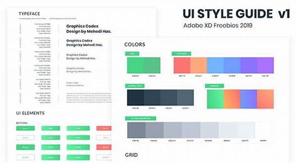
Elements of a Comprehensive UI Design Style Guide
1. Typography and Fonts: Choosing the right typography is vital in a UI design style guide. It establishes hierarchy and guides users in navigating content.
2. Color Palette: A carefully selected color palette boosts brand recognition and evokes the desired emotional response in users.
3. Icons and Imagery: Consistent icon styles and imagery within a UI design style guide contribute to user understanding and visual coherence.
4. Layouts and Spacing: Defines grid systems and spacing to ensure that the interface is clutter-free and intuitive to navigate.
5. Voice and Tone: This component of a UI design style guide outlines how the brand communicates with its audience, maintaining a clear and recognizable voice.
Crafting a UI Design Style Guide for Your Brand
A thoughtful UI design style guide takes into account not only visual elements but also the brand’s identity and target audience. Begin by gathering the core design assets, such as logos, specific colors, and typography. It’s essential to document how each element should be used, including examples and sample applications, to provide clear guidance. Definitions should be precise yet flexible enough to allow for creativity where appropriate, ensuring that the design remains engaging and fresh.
Equally important is the need for ongoing updates and revisions of the UI design style guide. As your brand grows and technology evolves, the style guide should be revisited regularly to incorporate new insights and trends. This proactive approach prevents the design from becoming outdated and supports a dynamic, responsive brand identity. By following this process, a UI design style guide can become an enduring asset that reflects both the present and future aspirations of the brand.
Practical Applications of a UI Design Style Guide
1. Team Collaboration: Facilitates smoother workflow between designers and developers by providing clear design expectations and standards in the UI design style guide.
2. Onboarding New Designers: Accelerates the learning curve for new team members by serving as a comprehensive design reference.
3. Brand Consistency: Ensures all digital assets and interfaces adhere to the brand’s visual and tonal identity outlined in the UI design style guide.
4. Efficiency: Reduces the time spent on design decisions by offering pre-defined guidelines, allowing teams to focus on innovation and creativity.
Read Now : Visual Harmony In Artist Portfolios
5. Quality Control: Acts as a benchmark for evaluating the quality and consistency of the design before launch.
6. User Experience: Enhances user experience by ensuring interfaces are intuitive and aligned with user expectations through adherence to the UI design style guide.
7. Accessibility: Incorporates guidelines for making designs inclusive and accessible to a broader audience.
8. Adaptability: Allows easy updates to design without compromising structural integrity, adapting to changing market trends and user needs.
9. Interdepartmental Communication: Improves communication across departments and stakeholders by providing a common language in the UI design style guide.
10. Innovation: Encourages experimentation within a secure framework, fostering creativity while maintaining brand integrity.
Maintaining Relevance in Your UI Design Style Guide
The digital landscape is ever-evolving, which means a UI design style guide should be dynamic, not static. Regular evaluations and updates are necessary to ensure that the visual language continues to meet current digital trends and user expectations. This process involves gathering feedback from users and internal teams to identify areas for improvement. By adopting a flexible approach, a UI design style guide can adapt to new challenges and opportunities, ensuring it remains a valuable tool for both design consistency and innovation.
Moreover, as brands evolve, their style guides should reflect these changes, from rebranding efforts to expansions in service offerings. The UI design style guide must accurately represent the current and aspirational states of a brand’s identity. This requires commitment and collaboration across all stakeholders, ensuring that the guide evolves in a way that enhances, rather than hinders, the brand’s vision. Embracing this proactive approach can differentiate a brand in the competitive digital marketplace, providing a clear path to achieving long-term success.
Implementing a UI Design Style Guide with a Growing Team
As a team grows, the UI design style guide becomes an indispensable tool for maintaining order and cohesion. It instantly familiarizes new team members with the established design principles, minimizing misunderstandings and facilitating harmonious collaboration. Clear and consistent documentation helps everyone stay on the same page, even if they’re working on different projects simultaneously. By reiterating the brand’s design priorities and providing comprehensive examples, the guide supports both creative autonomy and adherence to the overall brand aesthetic.
Recognizing the value of their contributions encourages team members to actively participate in the evolution of the UI design style guide, fostering a creative environment that thrives on collaboration and shared knowledge. A shared understanding of design standards increases efficiency and productivity, empowering team members to focus their efforts on innovation. With a robust guide as the backbone of design endeavors, the team remains agile and responsive to changes, whether it’s to accommodate technological advancements or shifts in user preferences.