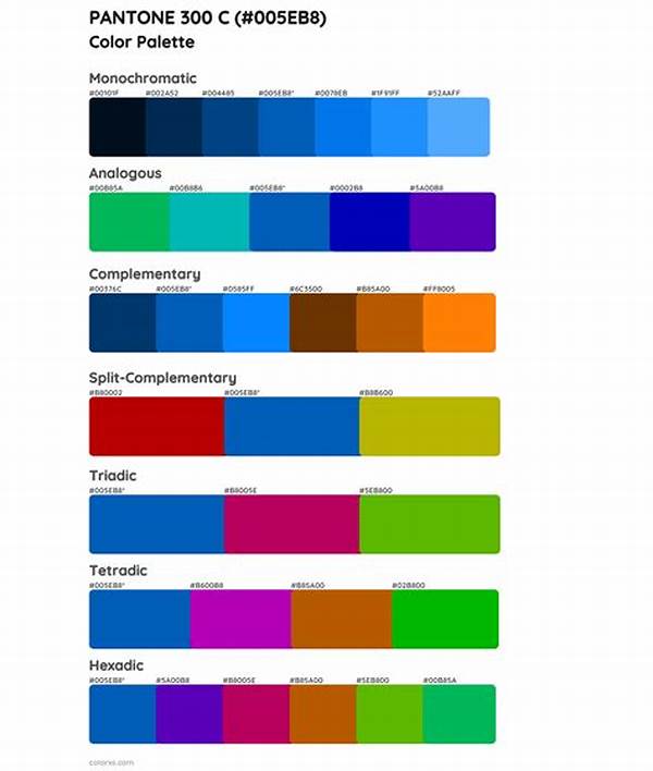
Color plays a crucial role in branding, influencing perceptions and emotions. The concept of color harmony is essential for creating effective branding strategies. By selecting the right color combinations, brands can convey their identity and values. This article explores different aspects of color harmony for branding, providing insights and explanations for its importance in establishing a powerful brand image.
Read Now : “creating Passive Income With Art”
Understanding Color Harmony and Its Impact on Branding
Color harmony for branding involves the strategic use of colors that work well together to create a cohesive and appealing brand image. Harmonious color combinations can evoke specific emotions, aiding in brand recognition and customer loyalty. For instance, warm colors like red and orange can convey energy and excitement, appealing to a dynamic target audience. Conversely, cool colors like blue and green are often associated with calmness and trust, which can be crucial for brands in the healthcare or finance sectors.
In the realm of branding, color harmony is not just about aesthetic appeal but also about communicating brand values and personality. A brand that masters color harmony can present itself consistently across various platforms, making it easily recognizable. This consistency helps in building a strong connection with the audience, reinforcing the brand message every time someone interacts with the brand’s visual elements.
Moreover, understanding cultural differences in color perception is vital for brands aiming for a global presence. Color harmony for branding must consider these differences to ensure that the brand message is universally understood and appreciated. Thus, selecting the right color palette becomes an integral part of the branding process, influencing not just visual appeal but also consumer perception and engagement.
The Benefits of Color Harmony in Branding
1. Enhanced Recognition: Color harmony for branding aids in creating a memorable brand identity, enhancing recognition across different mediums.
2. Emotional Connection: Effective use of color harmony can evoke the desired emotions in the audience, fostering a deeper emotional connection with the brand.
3. Conveys Brand Values: Carefully chosen color combinations reflect the brand’s values and personality, making it easier to communicate the brand message.
4. Consistency: Applying consistent color harmony in branding assures uniformity across all brand touchpoints, strengthening the brand’s image.
5. Improved Engagement: Attractive color harmonies draw attention and engagement, ensuring that the audience remains interested and invested in the brand.
Crafting the Perfect Palette for Your Brand
Color harmony for branding requires careful consideration of various elements to craft a palette that truly represents the brand. First, understanding the target audience is crucial. Different demographics respond differently to colors; therefore, it’s important to research and select colors that resonate with the intended audience. Additionally, analyzing competitors can provide insight into industry norms and help differentiate your brand through unique color selections.
Strategically combining colors to reflect brand values is another essential step. For example, a brand focused on sustainability might choose earthy tones, signaling its commitment to environmental responsibility. Conversely, a tech startup might opt for sleek, modern colors like silver or blue to denote innovation and reliability. Ultimately, the selected colors should be versatile enough to be used consistently across all brand materials, from logos to marketing assets.
Lastly, testing and iteration are vital components in perfecting color harmony for branding. Gathering feedback from potential customers and stakeholders can provide valuable insights, allowing brands to refine their color palettes. Adjustments might be necessary to achieve the desired impact, making the testing phase a critical part of the branding journey.
Read Now : Nft-driven Authentication For Digital Artists
Importance of Cultural Context in Color Selection
In the quest to achieve color harmony for branding, it’s crucial to consider cultural contexts. Colors carry different meanings in different cultures, and what works in one region might not translate well in another. Brands aiming for an international reach must be aware of these cultural nuances to avoid misinterpretation and ensure their message is conveyed as intended.
For example, while white is commonly associated with purity and peace in Western cultures, it is often linked to mourning in some Eastern traditions. Similarly, while red might symbolize luck and prosperity in China, it can have different connotations elsewhere. Being sensitive to these differences is essential in crafting a universally appealing and effective brand image.
In addition to cultural significance, color harmony for branding should also take into account current market trends. Staying informed about industry trends allows brands to remain relevant and engaging to their audience. Whether it involves adapting to sustainable practices or embracing new technologies, color choices can signal a brand’s adaptability and commitment to keeping pace with consumer expectations.
Key Considerations for Implementing Color Harmony
Achieving color harmony for branding is a multifaceted process involving numerous considerations. Firstly, brands must deeply understand their core identity and values to select a color scheme that aligns with their mission and vision. This alignment ensures that the colors not only appeal aesthetically but also authentically represent the brand’s essence.
Another crucial factor is the psychology of color. Different colors evoke different emotions and reactions; therefore, it’s important to choose colors that trigger the desired response from the audience. For instance, a youthful, energetic brand might opt for bold, vibrant colors to reflect its dynamic nature, while a luxury brand may select golds and silvers to imply sophistication and exclusivity.
Lastly, the practical application of color harmony for branding involves consistent use across all brand collateral. From digital platforms to physical merchandise, maintaining a cohesive color scheme reinforces brand recognition and strengthens consumer trust. By embedding these colors into every aspect of brand communication, companies can ensure that their brand is memorable and relatable.
Reflections on Mastering Color Harmony
Mastering color harmony for branding is an ongoing journey that involves a blend of creativity, strategy, and cultural awareness. For any brand, establishing a compelling color palette requires an in-depth understanding of both its audience and its unique attributes. By selecting a well-thought-out combination of colors, brands can forge a strong visual identity that resonates on multiple levels.
It’s important to remember that color harmony goes beyond mere aesthetics; it’s about creating an emotional connection and communicating the brand story. A successful color palette should speak volumes about the brand, offering subtle cues that reinforce its core message and values. Through careful consideration and strategic implementation, brands can make colors work to their advantage in crafting a lasting and impactful presence in the market.
In conclusion, color harmony for branding is a powerful tool in the arsenal of any brand strategist. By harnessing the emotive power of color and aligning it with brand goals, businesses can enhance recognition, foster trust, and ultimately drive customer loyalty. As markets continue to evolve, the fundamental practice of integrating well-crafted color harmony remains constant, underscoring its enduring relevance and effectiveness in the world of branding.


