Color harmony plays an integral role in various fields, from art and design to marketing and interior decorating. It is the process of arranging colors to create visually appealing and balanced combinations. This article delves into the key principles of color harmony, providing insights into the fundamental concepts that can transform any creative venture into an aesthetically pleasing masterpiece.
Read Now : Integrated User Interaction Flow
Understanding the Key Principles of Color Harmony
The key principles of color harmony revolve around creating a balanced and cohesive arrangement of colors that are pleasing to the eye. Color harmony is not just about selecting colors that match; it’s about finding the right combination that conveys the intended message and evokes the desired emotions. There are several theories and methods used to achieve color harmony, each with its own unique approach.
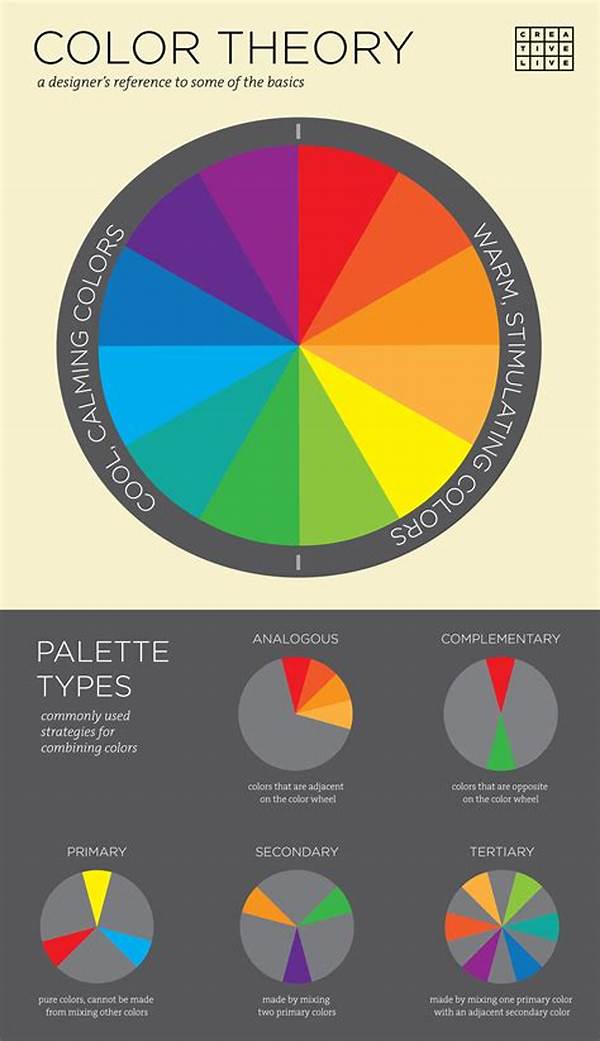
The color wheel is a fundamental tool in understanding the key principles of color harmony. It helps in identifying relationships between colors, such as complementary, analogous, and triadic schemes. By using the color wheel, designers can create combinations that provide either high contrast or smooth transitions, depending on their needs. Another key principle is the consideration of color context, which involves understanding how surrounding colors influence the perception of a specific hue.
Moreover, the psychology of color plays a profound role in the key principles of color harmony. Different colors can evoke different emotions and associations, making the selection process crucial for effective communication. For instance, warm colors like red and orange can stimulate and energize, while cool colors like blue and green can create a calming effect. Mastering these principles can significantly enhance the impact of visual projects, ensuring they resonate with the intended audience.
Elements of Color Harmony
1. Complementary Colors: Complementary color schemes play a vital role in the key principles of color harmony by pairing colors opposite each other on the color wheel. This high-contrast combination is visually striking and commonly used to create vibrant and dynamic designs.
2. Analogous Colors: Analogous color schemes are essential in the key principles of color harmony. They involve selecting colors adjacent to each other on the color wheel, resulting in designs that are harmonious and often evoke a calming effect.
3. Triadic Colors: Triadic color schemes are a staple in the key principles of color harmony. By choosing colors evenly spaced on the color wheel, designers can create a balance of contrast and harmony, producing vibrant yet stable visuals.
4. Tetradic Colors: The tetradic color scheme involves using two complementary pairs, making it essential in understanding the key principles of color harmony. This approach offers diversity in composition, allowing for lively and colorful designs.
5. Monochromatic Colors: Monochromatic color schemes simplify the key principles of color harmony by using variations in lightness and saturation of a single hue. This approach creates a cohesive and visually soothing effect, often used for elegant and sophisticated designs.
Applying Key Principles of Color Harmony in Design
The application of key principles of color harmony in design is both an art and a science, demanding creativity and meticulous attention to detail. Designers must consider not only the aesthetic appeal but also the message they wish to convey. By understanding color relationships and their psychological implications, designers can make informed choices that enhance their work’s overall impact.
For instance, when designing a logo or branding materials, maintaining consistency with the selected color scheme is crucial. The right harmony of colors ensures the brand’s message is clear and memorable, while also evoking the desired response from the target audience. Similarly, in interior design, the use of color harmony can create a particular mood or atmosphere in a space, such as warmth and coziness or openness and freshness.
Furthermore, digital platforms require special attention to color harmony due to the diverse range of screens and resolutions. Designers must adapt the principles to ensure their work remains consistent and visually appealing across devices. By mastering these key principles of color harmony, creatives can elevate their designs, making them truly resonate with the intended audience.
The Psychology Behind Key Principles of Color Harmony
1. Emotional Impact: Colors have psychological effects essential to the key principles of color harmony. They can evoke emotions and influence perceptions, making the choice of color schemes critical in design.
2. Cultural Significance: Different cultures interpret colors in varied ways, affecting the key principles of color harmony. Awareness of these cultural differences ensures designs are respectful and effective in different contexts.
3. Contextual Influence: The context in which colors are used significantly impacts the key principles of color harmony. Designers must consider how surrounding elements influence color perception to maintain balance and coherence.
4. Brand Identity: In branding, the key principles of color harmony help in creating a recognizable and strong identity, ensuring the selected colors align with the brand’s values and target audience.
5. Natural Inspiration: Nature often inspires color harmony, weaving the key principles into everyday aesthetics. Observing natural color combinations can guide designers in creating harmonious schemes in their work.
Read Now : Building Artist Brand On Instagram
6. Seasonal Trends: Seasonal color trends play a role in the key principles of color harmony, guiding designers to adapt their palettes according to time-specific aesthetics that resonate with audiences.
7. Visual Accessibility: Considering color blindness and visual impairments is crucial to the key principles of color harmony, ensuring designs are inclusive and perceivable by all audiences.
8. Market Appeal: Understanding market preferences is critical for the key principles of color harmony. Designers use this knowledge to create appealing and competitive compositions within specific industries.
9. Balance vs. Contrast: The balance between contrast and harmony defines key principles of color harmony. Achieving the right level ensures visual interest while maintaining coherence.
10. Innovative Approaches: Constantly evolving strategies in the use of color shape the key principles of color harmony. Staying updated with innovations allows for fresh and engaging designs.
Challenges in Mastering Key Principles of Color Harmony
Learning the key principles of color harmony can present challenges, particularly when confronting the subjective nature of color perception. Each person may perceive colors differently due to factors like personal experiences or physiological differences, which can complicate the application of these principles. Additionally, the vast array of colors and combinations can often overwhelm those new to the concept.
One solution is to start with simplified color schemes, gradually building on complexity as one becomes more comfortable and knowledgeable. Experimentation is also a crucial part of mastering color harmony. Designers often draft multiple versions of a design to compare the effect of different color schemes before settling on the most effective option. This iterative process aids in understanding how slight variations can impact overall harmony.
Furthermore, staying abreast of current trends in color usage helps in effectively applying the key principles of color harmony. Engaging with resources like design journals, webinars, or workshops can provide valuable insights into how others successfully navigate complex color relationships. By combining education, practice, and creative exploration, designers can overcome these challenges, applying color harmony principles to create compelling and impactful compositions.
Embracing Key Principles of Color Harmony in Everyday Life
The key principles of color harmony extend beyond professional design fields and manifest in everyday life. Whether choosing an outfit, arranging furniture, or preparing a meal with vibrant ingredients, color harmony plays an invisible yet powerful role in daily decisions. Recognizing and applying these principles can enhance personal aesthetics and experiences on a practical level.
Individuals can explore harmony by crafting personal spaces that reflect their preferred moods or style. This might involve rearranging furniture to create a balanced relationship between color and space or selecting home accessories that complement each other seamlessly. Such endeavors not only improve the aesthetic appeal of living areas but can also contribute to well-being by creating environments that are restful or energizing, depending on personal needs.
The joys of color harmony can also extend to hobbies and personal projects. Whether painting, gardening, or crafting, applying the key principles of color harmony can elevate personal satisfaction and creativity levels. By integrating these foundational concepts into everyday life, anyone can enjoy the beauty and balance that color harmony offers, enriching both professional endeavors and personal pursuits.
The Ever-Evolving Nature of Color Harmony
Color harmony is not static; it evolves with cultural, technological, and artistic advancements. As new trends emerge and tastes shift, the understanding and application of the key principles of color harmony must adapt. For creators and consumers alike, this dynamic nature offers both a challenge and an opportunity to explore fresh perspectives and innovative approaches to color usage.
Technological advances continually reshape the possibilities for color harmony, with digital tools offering new ways to experiment and visualize color interactions. Such tools can simulate different environments or lighting conditions, providing a platform for designing more accurately and adaptively. Additionally, as global cultures increasingly intersect, the nuances of color interpretation become more complex, requiring a more inclusive and diversified approach to color harmony.
In embracing the ever-evolving nature of color harmony, designers and non-designers alike are encouraged to adopt a flexible mindset. By remaining open to change and committed to continuous learning, they can keep their work appealing and relevant, navigating the vibrant tapestry of colors with creativity and dexterity. Ultimately, the continued exploration of color harmony not only enhances visual outputs but also enriches our understanding of the world through a colorful lens.