Typography is a critical component in creating a website that not only looks appealing but is also functional across various devices. As digital consumption continues to grow, the call for responsive design has never been more pressing. Responsive typography best practices not only ensure that your text is readable but also aesthetically pleasing, regardless of a user’s device. This article will delve deeply into this subject, offering insights into optimizing typography for the digital age.
Read Now : “digital Ownership In The Art Industry”
Understanding Responsive Typography
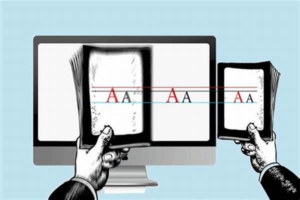
In today’s digital landscape, responsive typography best practices are essential for delivering a seamless user experience. As devices with varying screen sizes flood the market, ensuring text legibility across different platforms has become a necessity rather than an option. Implementing responsive typography involves altering font sizes, line height, and spacing to adapt to diverse screen dimensions.
Responsive typography best practices demand a balance between design aesthetics and functionality. Using relative units like ems or rems instead of fixed pixels allows text to scale beautifully on both high-resolution and low-resolution screens. Another practice includes the use of media queries in CSS, which dynamically adjust typography based on the device’s screen size. These adjustments are integral in maintaining the readability and visual hierarchy that communicates a website’s message effectively.
Ultimately, responsive typography best practices are about ensuring text clarity and maintaining visual appeal while delivering content across various platforms. Whether reading on a mobile phone, tablet, or desktop, users expect a consistent typographical experience. By implementing these techniques, designers can create websites that are not only visually engaging but also accessible and readable, regardless of device type.
Key Elements of Responsive Typography
1. Fluid Typography: Incorporate responsive typography best practices by using scalable units such as percentages or viewport widths, ensuring that text size adapts smoothly to different screen sizes.
2. Media Queries: Employ CSS media queries as part of your responsive typography best practices to fine-tune font sizes and spacing for a variety of devices.
3. Line Height and Spacing: Ensure adequate line height and spacing to enhance readability, integral in responsive typography best practices.
4. Font Selection: Choose fonts that are versatile and legible at various sizes, a core component of responsive typography best practices.
5. Testing Across Devices: Ensure consistent application of responsive typography best practices through rigorous testing on multiple devices and screen sizes.
Implementing Responsive Typography Strategies
Responsive typography best practices are essential in modern web design. The first step in implementation involves selecting the right typographic units. Choosing scalable units, such as ems or rems, allows your text to adapt to differing screen sizes seamlessly. These units work in conjunction with media queries, an essential tool in your CSS, permitting typographic adjustments based on the user’s viewport.
Another key strategy involves modifying line height and spacing in tandem with font size adjustments. This practice aids in preserving readability and flow across screens. Equally important is choosing a font that maintains clarity and legibility even when resized. Fonts like Arial, Verdana, or Open Sans are commonly favored due to their versatility and readability at various sizes.
Finally, testing cannot be overstated. It is imperative to evaluate your designs across multiple devices and platforms to refine these responsive typography best practices, ensuring optimal user experience. With these strategies proficiently enacted, you will enhance both the functionality and aesthetics of your web design.
Responsive Typography Tools and Techniques
Responsive typography best practices involve utilizing various tools and techniques that aid in delivering optimal user experiences. Using scalable type options is paramount; tools like CSS Grid or Flexbox provide the necessary flexibility to adapt text layout dynamically. Moreover, using the clamp() CSS function can offer a streamlined approach to sizing text fluidly.
Another technique involves employing frameworks like Bootstrap, which incorporate default responsive typography settings. Leveraging these settings can accelerate the development process while maintaining consistent typographic quality. Furthermore, platforms like Google Fonts offer extensive libraries of web-safe fonts optimal for responsive designs.
Read Now : Enhancing Transnational Research Initiatives
Importantly, combining these tools with certain best practices — such as adequately setting default and max font sizes — ensures correct scaling for diverse devices. Ultimately, integrating these responsive typography best practices improves both visual aesthetics and functional adaptability, enhancing overall web effectiveness.
The Role of Metrics in Responsive Typography
While customizing typography, metrics play a critical role in responsive typography best practices. Controlling how text elements scale inevitably affects line length, line height, and margins, which all contribute to readability. By measuring and adjusting these aspects, you can ensure your text remains readable and engaging across varying screen dimensions.
First, consider the line length; the ideal range is generally between 50-75 characters. This balance helps maintain the readers’ focus without overwhelming them. Meanwhile, line height should be set around 1.4 to 1.6 times the font size to preserve a comfortable reading experience. Having adequate margins can also aid in text readability, particularly on smaller screens.
Responsive typography best practices also involve observational testing to analyze user engagement with varying typographic settings. This data aids in refining and customizing typographic choices to match user preferences. Thus, incorporating metrics and evaluations not only enhances user retention but also strengthens the overall impact of your digital typography.
Importance of Consistency in Typography
Consistency remains a cornerstone in the application of responsive typography best practices. A cohesive typographic style across your website not only contributes to an improved user experience but also aids brand recognition. With uniformity in font choices, sizes, and styles, your digital presence becomes more credible and visually comforting to users.
Inconsistencies, however, can cause confusion and interruption in user engagement. Ensuring that typographic elements, like headings, body text, and links, adhere to a consistent style guides the user through the content. This uniformity, when combined with responsive adjustments such as fluid sizing and media queries, delivers a coherent message regardless of device usage.
Ultimately, responsive typography best practices lead to a more trustworthy and engaging digital experience. Investing time in achieving typographic consistency pays dividends in user satisfaction and trust, both of which are invaluable resources for any website.
The Essence of Accessible Typography
At the heart of responsive typography best practices is accessibility, an essential aspect which cannot be overlooked. As web inclusivity becomes increasingly prioritized, ensuring your typography meets accessibility standards is crucial. This includes color contrast, font choice, and text scalability to accommodate users with diverse needs.
Selecting high-contrast color palettes aids in improving text visibility for users with visual impairments. Simplicity in font choice, steering clear of overly decorative styles, also contributes significantly to user-friendly readability. Responsive typography best practices further encourage the inclusion of alternate text and ARIA labels to enhance accessibility through screen readers.
By embedding these practices, not only do you cater to a broader audience, but you strengthen compliance with accessibility guidelines. Ultimately, accessible typography furthers the reach of your content, cultivating an inclusive environment that reflects positively on your digital ethos.